TED Ask Me Anything section
Project 3 - Week 4 & 5 UXDi Course - General Assembly London
The Brief
A concept project to extend the TED experience, allowing users to ask thought leaders questions in a paid “Ask me anything” Q&A service. Three specific user objectives were defined in the brief:
Users should be able to ask and vote for questions
Viewers should be able to search, discover and browse AMAs
Experts may be able to conduct video and/or text based exchanges
Overview of processes employed per phase
Research phase: Competitor analysis, Contextual inquiry, User interviews, Affinity mapping, Persona development, Persona driven task analysis, Persona driven user journey
Design phase: Information architecture, User flows, User story mapping, Feature prioritisation, Wire flows, Interface sketches, Mid fidelity digital interfaces
Prototyping and testing phase: Rapid prototyping with InVision app, Usability testing observations and commentsTools used
Pen and Paper, Omnigraffle, Sketch, InVision
Tools used
Pen and Paper, Omnigraffle, Sketch, InVision
Team
Annelise Nelson, Dorota Kacejko, Jon Dawson, Niki Morariu
Duration: 2 Weeks
The Process
Discovery
As a group we conducted a Competitive Analysis for TED and AMA question and answer sections. We found that most AMAs are text only and can be held by anyone, not just by experts. The people hosting the AMA can answer questions over a long period of time so aren’t likely to be overcome by too many questions. These companies were successful at allowing users to vote for questions and answers, and by suggesting similar questions to reduce the number of duplicate questions. Where there was a ‘live’ or ‘video’ element, competitors grouped the events as past or upcoming to facilitate searching. Users were encouraged to enter their questions in before the event and sometimes a moderator was present.
With this information we posted on some social media sites a simple survey in order to recruit user interview candidates. We had over sixty responses and of these there were around fifteen people who agreed to be interviewed further.
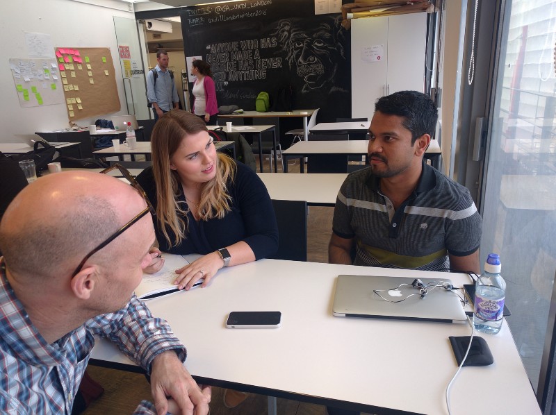
In pairs we conducted user interviews the following day, revealing that voting for questions was generally a well regarded method for improving the quality of questions being asked. However, interviewees were skeptical about moderators as they felt they introduced bias and didn’t embody the ‘ask me anything’ ethos. Our interviews also highlighted two main challenges specific to the brief. They highlighted that it was often incredibly difficult to connect with or contact a high profile thought leader, and consequently, it was very challenging to ask that thought leader a question.
As a team, we analysed the behaviours, goals and attitudes of our interviewees, and created an Affinity Map to help identify trends that could help guide our design process.

These trends enabled Dorota and I to formulate example characters (Personas) that represented our target users; We had ‘Paul’ the ‘passive optimist’, ‘Bradley’ the ‘sharing contributor’ and ‘Marsha’ the ‘pessimistic taker’ . We decided that the ‘passive optimist’ character ‘Paul’ would be our primary user for this project as he valued expert interaction the most.


OUR HYPOTHESIS FOR THE TED AMA SERVICE:
By providing Paul with the ability to ask a thought leader any question, Paul will be able to:
Connect with more thought leaders
Ask those thought leaders the questions he cannot find answers to elsewhere
Interact with a wider network of interesting people
Be inspired by those thought leaders and learn from their experiences and stories
With Paul in mind, we analysed how his journey through the site might look; finding an AMA session, asking a question, voting for a question and seeing the expert's response. Knowing our user’s journey through our site, and the business goals of the project, we prioritised functions and features to take into the design phase.
We started to brainstorm ways to allow TED to capitalise financially on these events, concluding that all users would be able to watch past events, but only those who paid a monthly subscription would be able to ask questions and witness the live event.
Design
Design Studio

In our Design Studio, our whole team started ideating how our most complex, integral screen would look on a mobile device. We started on mobile applying Luke Wroblewski’s strategy to to enforce the most spatial constraint and to ensure our interface was as simple as possible.
The output of the workshop was used as the basis for our first complete set of sketches.

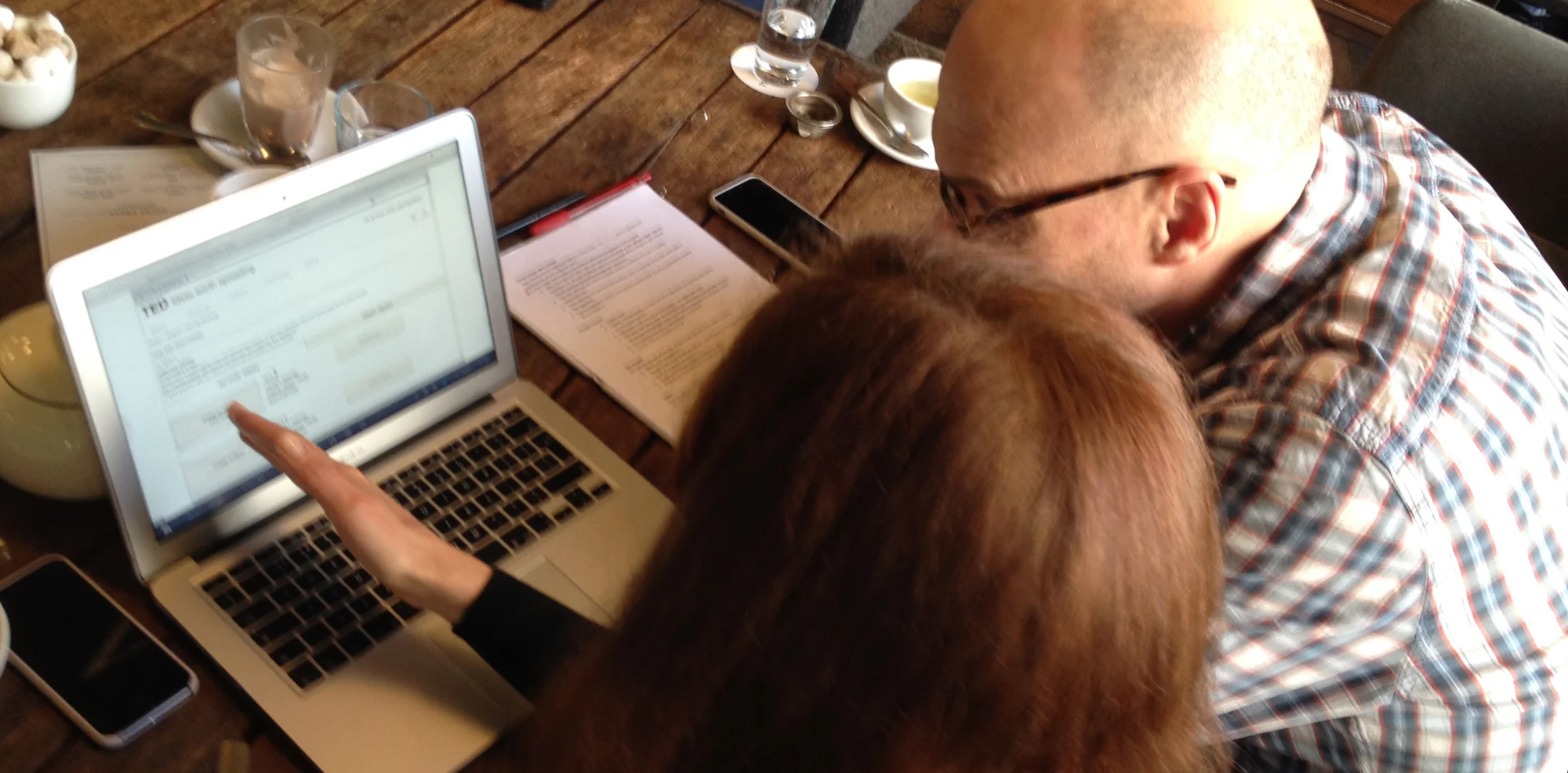
The whole team then tested the mobile paper sketches to gather usability feedback before converting the mobile designs into desktop sketches. We then developed our sketches into mid-fidelity digital wireframes using Omnigraffle where were then assembled into a clickable prototype in Invision ready to test.
Findings
We used this hypothesis to test both TED’s initial premise for a microsite, and also to test the success of the prototype. User testing confirmed that the premise for the project was well received and provided us with three key areas where we could iterate our design:
Our initial grouping of AMA events into two groups, “Active” and “Past” was not clear to users

“If an event is happening now, it’s not upcoming so...where do I go?” — Wanran, Data Scientist
Iterating from this, we split the events into three groups, “Past”, “Active now” and “Upcoming”.
Original notifications were for confirmation only but users wanted these to work a bit harder for them:
“At this stage I’d want to know how I should prepare and then maybe send an email.”
Here we reacted by giving extra information to those notifications and actions like “adding event to calendar”.
Our original voting design was overwhelming:
“There are stars and arrows and hashtags! Whoa!”
So we stripped the voting design right back.
Having iterated our mid fidelity designs based on the feedback we received, we then went on to create high fidelity designs for both desktop and mobile. We’d like to use these to get richer feedback from user testing and to test the effectiveness of different icon variations, particularly around voting and tagging of questions and answers.

Next steps
In the next sprint for this project, we’d like the opportunity to refine the visual design of elements such as the voting and tagging systems. Though the design was intuitive enough for some users, others were a little confused.
The area that proved most problematic in testing was TED’s global navigation system. The labels of ‘Watch’, ‘Discover’, ‘Attend’ and ‘Participate’ seem interchangeable and so users had trouble locating the new AMA events section. Possibly because AMAs are a format that is watched, attended and participated in, it may be necessary to alter the top level information architecture and add AMA’s as a new global element.
Both interviewees and testers expressed interest in being able to integrate AMA events they'd registered for with their own existing digital calendars.
The whole team felt that future iterations should explore the idea of 'opening-up' the expert's unanswered questions to the community to answer, thus addressing the requirements of another of our personas, Bradley the sharing contributor.