
Culture Club Mobile App
Concept Project 1 — Week 1 and week 6, UXDi Course — General Assembly London
The Brief
With a partner, quiz them about their interests and needs and find a problem in their daily lives that can be solved with the design of a simple mobile app.
Design the app and mock up at least 3 key screens from the app to high fidelity. Test designs with at least 3–5 people (as close to your original user as possible)
TEAM
Just myself. All aspects of research, design, testing and deliverables completed solo.
DURATION: 2 WEEKS
METHODS AND SKILLS USED DURING THE PROJECT
User interviews, concept mapping, user flows, page flows, sketching, paper prototyping, testing, presenting. Mood boards, word association, sketching, personality matrix, Goldilocks statements, brand personality framework, desirability testing, paper prototyping, user testing, presenting. Generation of a questionnaire to test design objectives.
TOOLS USED
Pen and paper, Pop app, InVision, Sketch, Adobe Capture, Photoshop & Illustrator
Massimo’s Problem
Massimo has recently moved to London from Italy. He finds London’s size causes a number of problems for him, the biggest of these is making friends that are local to his vicinity.
He would like to meet people from around the world, have fun, learn about their culture and possibly some basic language.
The Solution
A social network app called Culture Club. This will give Massimo the opportunity to see an approximate location of club members, and by clicking on a member’s icon on a map have access to their profile page, chat with them and ultimately make friends.
The Hypothesis to be Tested
I believe that building the Culture Club app for Massimo will give him the opportunity to make friends with people of various nationalities close to his location.
The app will be deemed a success when it is clear that Massimo is making more and more friends from using the app.
The Process
Finding the User Goals
Initial one-to-one interviews were held with Massimo. I took notes and made concept maps clarify his requirements.
The findings revealed that Massimo finds interactions with people in London frostier and more superficial than at home in Rome. He feels that the city is so large and daily life so fast moving that he would rarely see people more than once in the same location.
“Initial interactions are colder than in Rome”
“I don’t get to see a person again as the city is too large”
Developing the Idea
Further interviews and participatory sketching revealed that, rather than concentrate on creating prototypes that met with all Massimo’s requirements it would be better to get the prime requirement of finding new friends addressed and come back to his other requirements in later releases.
The interviews enabled me to create some low fidelity wireframe interface designs to test with Massimo, and a series of user flow diagrams from the data.
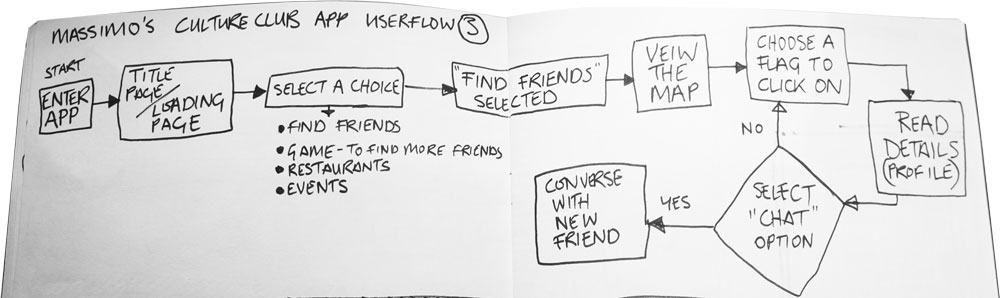
These user flow diagrams provided the information required to create initial wireflow sketches and, again, test them with Massimo.The first sketches Massimo felt were the second round of testing they looked like this

These he assessed and approved and from this it was possible to create interface designs for testing.

These paper prototypes were tested with the participant and then digitised using the POP interactive prototyping tool, into a mobile phone similar to Massimo’s. These could then be tested with Massimo and a wider user base.
Interactive Prototype Test 1 Feedback

On the menu page the ‘Find Friends’ button should read ‘Find New Friends’ as ‘Find Friends’ could mean find existing friends also.
On the member profile page change chat tile icon to a speech bubble as it is unclear where to click.
On the member profile page the profile information window should be changed from a speech bubble into a chamfered rectangle, again because it unclear where to click.
Interactive Prototype Test 2 Feedback
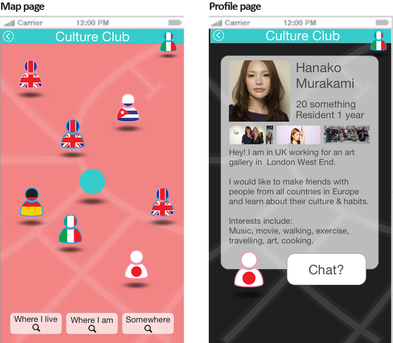
On the map screen there is no icon or circle to pinpoint the position of the user.
From the profile page Massimo would like a link to images uploaded by the member.

Interactive Prototype Test 3 Feedback (current version)
On the map page the member icons should be shown in pink for female and blue for male, with another colour for members who would prefer not to specify.
On the map page it would be helpful to include a small area locator window at the bottom, so that the user has an idea of where they are.
Visual design phase
How the user should feel when using the app:
Part of a fun international community. Safe. Confident and willing to reach out, join in and meet people.
In order to identify a theme appropriate to the usability and personality of the app I created a moodboard (a collage of materials that convey a specific style, concept or emotion), and used word association to aid sketching.

Culture Club voice description
The voice of Culture Club is fun friendly and clean. We want our customers to feel safe in our hands, empowered to be brave and get out there and meet new people from around the world, all living in their neighbourhood. We’re honest and sincere, cheerful and reliable.
Between myself and a colleague we considered the brand attributes for the app by using a brand personality framework, and generated Goldilocks statements.
Using the word information and sketches generated it was possible to create paper wireframes of how the app could look and test the visual designs with potential users to gain feedback.

The feedback focused on the map screen and the lack of information; The icons don’t let the user know what each one represents, only a country; There is no information on the screen to let the user know what they can do here; Is it possible to find a member of the community in other areas, or close to where the user is now? Also the loading screen illustration seemed over complicated and not consistent with the brand voice.
Taking the feedback into consideration initial digital wireframes were created and tested with users.
From the results a further iteration was created.

Questionnaire
Using this, the third iteration, a questionnaire was created to ascertain whether the brand voice was being conveyed through the visual design. The questionnaire consisted of word association processes including the personality matrix method and desirability testing. It was tested with a number of users.
The questionnaire proved that the visual design managed to convey the brand well. The subsequent iteration included a further two screens for testing and some minor alterations to the user’s profile icon in the header and the background colour in the profile page.

Outcome
The version above was critiqued with four potential users and a final iteration was created as shown below, with changes to the main fonts, imagery and buttons.

Future Steps
This initial version of the app only focused on the ‘Find New Friends’ part of the tool. The later versions would involve development of the other menu items in the list: Existing Friends, Game to find more friends, Restaurants and Events.
Further user testing from a visual design perspective, questioning the value of the colours of the outlines to the icons and buttons which convey the gender of the users.
On the chat screen move the recipient’s name and icon to the right in line with convention.